

In this section, we interviewed several people and walked them through the two proposed prototypes. This allowed us to understand what was intuitive about our design, what was hard to understand, and what was unnecessary. Each user has agreed to the terms in the consent form.
Throughout these interactions, we worked with two different prototypes, shown below:
Left: Not Your Average Joe's (NYAJ) design. Right: Masala Art (MA) design
Our paper prototypes are described in more detail here.
Before going out to test real users, we first tested a group member, Will, to make sure that they worked. In doing so, we learned some interesting things about both prototypes.
[can will or ben plz fill this out?]
Because Will knew the overall concept of the design and uses an IPhone, he did not have a problem finding the access code and entering it in. One cause of confusion was that the initial design listed the foods by price, with an expandable window that included the name of the food. Will pointed out that although price is cool to know, most people identify what they ate by food name, not price, so the two pieces of information should be reversed.

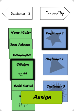
In the initial design, the user needed to click the food items, click the number of people it was to be split among, and hit a button "split" to confirm the transaction. Even if you were only to pay for your meal, you would go through this interaction, in order to generalize the process. Will found this unnecessarily confusing, however. One suggested alternative was to leave the design the way it was, but if Will moved on without hitting split, the very last person would be assigned to the food by default. This was still confusing, so we decided to use the old strategy, but change the "split" button to "assign".


Finally, Will did not like the buttons labeled as "Customer 1", "Customer 2", etc, since it was very hard to keep track of who was who. Initially, we hoped the icons would help the memory recognition, but it didn't quite do the trick - a hint was provided in which you could double-click a customer button to enter in a name.
Because Will is a member of our team and took part in developing the design, he didn't have any big idea concerns.
Tinkles is a senior undergraduate student at a small engineering college. While taking this test, Tinkles was mildly intoxicated, and due to familiarity, was not hesitant with criticism. Tinkles does not use an IPhone or ITouch, but is quite familiar with touch screen technology. We tested Tinkles with the MA prototype.
Tinkles' main concern was in having to do too much. When given the access code, he did not like having to enter capital letters because it required a capitalization key press. Tinkles also did not like dragging, and preferred clicking because the ability to touch things for a long time was hard to do accurately.
In addition, Tinkles did not like the two layers of abstraction, in which a person was represented as a customer number, an icon, and a name. Also, the prototypes contained many screens, and the inability to finish the interaction quickly annoyed Tinkles.
Tinkles also did not like the Chicken Masala (2) representation of showing two orders of the same meal. He said it didn't make sense whether this meant there were two orders or two people.
One main design decision resulting from Tinkles' interaction is the addition of a confirmation page. Although no financial transactions are made using Payr, Tinkles did not like the idea of going forward without being sure that he didn't do anything wrong; he wanted to see a final listing of each person and the foods they were paying for.
Princess is also a senior undergraduate student at a small engineering college. Princess is familiar with technology, but doesn't usually use it for situations not requiring it. Her overall claim on the idea is "I wouldn't use it, but I can see why people would."
We tested Princess on the NYAJ design. She, too, had a hard time finding the customer ID on the receipt, and had some confusion keeping track of customer numbers and people. Princess was very hesitant in pressing the buttons, but had a clear intuition of what to do - drag the food to the people and press assign; she kept asking us if her idea was the right thing before doing it. This could be because she isn't a frequent IPhone or ITouch.
We did try a couple other scenarios with Princess, but because she was cognizant, she didn't really have too much trouble going through the interactions of splitting among many people, assigning the right mode of payment to each person, etc.
Some interesting design discussions came up when we prompted Princess to change the recommended tip percentage. "That's really tacky," she replied. "When would you ever say to your friends, 'Let's give less money'?" We then gave her a scenario in which the waiter was so bad that everyone complained horribly and suggested deducting from tip, in which she agreed that the interaction was possible.
On the next screen, Princess was prompted to assign payment methods to each person. Her first question was "So do I pay using this? Is there some sort of card scanner?" We told her that no financial transactions could be preformed by Payr, and that all you were doing was telling the waiter how to process multiple credit cards and give out correct amounts of cash. Princess again thought this was impolite; whenever she goes out, she always either pays the whole thing using one credit card or pays completely in cash. For a user like her, this screen would therefore be entirely unnecessary.
Smith is a 24 year old college graduate who now works as a junior consultant at a firm in Boston. He lives with one housemate and has a girlfriend, and the three of them often go out to eat together. Smith and his friends almost always split the bill evenly, and says that although he sees the benefit of having a handheld bill calculator, he wants that interaction to be faster than his current interaction, which is already quite simple and fast. Although Smith does not use an IPhone, he does like the idea of purchasing one when his Verizon plan is used up.
We tested Smith on both prototypes, which allowed us to evaluate them against each other.
As someone with previous design experience, Smith was quick to give feedback on the little details. On the front screen, Smith remarked that he did not like the order that information was presented. Although presenting the customer ID prompt upfront gave him a clear indication of what to do for that page, it encouraged him to ignore the rest of the page, which took away from his overall understanding of the application. Smith, like others, had difficulty finding the customer ID on the receipt as well, so we added a small indication icon.

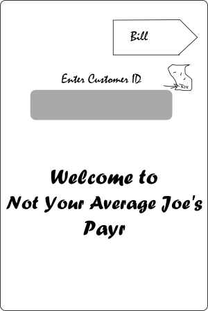

As an overall design concern, Smith also found the interaction of typing in a customer ID alone to be a bit cumbersome, compared to his usual "Just split it evenly" procedure.
We then progressed to the second screen, where Smith was asked to assign people to their orders. A bunch of questions arose at this point: What if I hit customers instead of food? What about food instead of customers? Smith mentioned that although our interface allowed for both, his natural inclination is still to drag items, not click and assign.
In our interface, we allow the user to select as many foods and people as they need and assign them all evenly by hitting "assign" after selecting everything on the screen. This brought up a reversibility problem for Smith: What if he made just one small mistake? We showed him that it was possible to expand on each customer's orders and decide what items to remove. Although Smith acknowledged this as a plausible solution, he deemed it a bit too cumbersome and hidden, and would personally just start the interaction over instead.

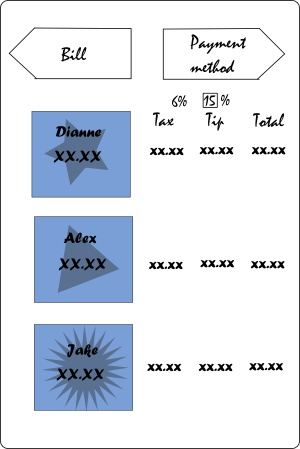
On the tip and tax page, Smith commented that there were too many numbers. He did not care to see, for example, the amount of tip added if he could already specify 15% tip. "What's important is my final amount. If I know I'm paying 15% tip, I don't really care to see what 15% is." He also commented that having a lot of numbers can easily be complicated when there are too many people. In response, we created the following changes to maximize the efficiency of the information presented:


As for the payment method page, Smith did not find any use for it. "I wouldn't even bother entering my name into the program," he said. "Marking payment methods wouldn't help the waitstaff at all." Instead, Smith would prefer to see some sort of confirmation page, so that he could copy the information down onto a receipt.
Overall, Smith found the interaction possibly useful, but altogether not a good replacement for the simple "Let's just split it and add 15% tip" plan he usually uses. In situations where there are 10 or more people, or there are other guests who he isn't very familiar with, he might consider using a handheld tip calculator, but in the case of just going to dinner with close friends, he would not find it useful at all. To fit these concerns, we offered a compromise: an express option where he can quickly enter in the number of people, and the application would divide the total evenly and inflate tax as necessary. Smith seemed very excited about this idea.

 >
>
In general, Smith liked MA Prototype more than NYAJ Prototype. From the beginning, he liked the cover page, where the application's purpose is presented before any tasks are asked. As he used the application, however, he had many more questions about what the program did or did not know.
Because we presented the default view with 5 customers already entered into the system, Smith's first question was "How does the application know how many people are at my table?", belying the real question: "What if I want to add or subtract customers from the application?" We answered that the waiter initially counts the number of people, something he/she normally does while taking orders, and enters it into the system that way. We also added an "add customer" button and a close option to delete a customer entry.


Because this interface only allows for 2-3 items to be shown on the screen at any given time, Smith became skeptical in not being able to verify his orders. It takes a while before the scrolling arrows are apparent; perhaps that should be enhanced.
We therefore decided that an order verification page is necessary both before and after the interaction, to assure the user that the right receipt is used.

After using the first interface, Smith automatically presumed that clicking was the way to map food to people. Upon realizing that he should be dragging instead, he decided that that was a better interface.
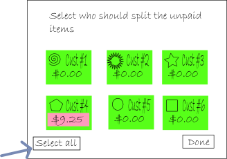
Smith also asked for the addition of a "Select all" option. Although splitting the bill evenly is easier with the "split unclaimed items", it still requires someone to select each party member, and reversing the decision seems difficult.
On the tips page, Smith liked the slider bar, saying that it fits the IPhone interface more than the keyboard input.
On the payment types page, Smith liked the ability to drag people into payment options, saying that he would be more willing to do this interaction than checking boxes. He was skeptical in assigning card and credit when the customer name wasn't even entered in, but upon exploring the application, he realized that the choice happened later in a pop up box.
A concern Smith then had was: What happens if he forgets to drag a customer down? Can you move on without specifying a payment type?
Smith found the confirmation page confusing, and said he probably would go just to submit. We compared this to the confirmation page on the Not Your Average Joe's confirmation page and realized the same lesson as before--less is more--and ported that design to this prototype.


Left: Original confirmation page design, Right: Revamped confirmation page design
Judy is a third year student at Wellesley college with a little bit of design experience. Although she doesn't use an IPhone, she is familiar with the concept and would use it if she had that option. Because she does not have much personal experience using the IPhone, she was not as comfortable to just mess around with the screen and figure out what each button does.
From the beginning, Judy was a bit shy in figuring out how to use the keyboard. She did, however, identify where the paycode was on the receipt. When presented with an option to use the express mode, she chose that right away, but then pressed "Proceed" as well, showing that perhaps our introduction page didn't present an option, but a procedure. We therefore renamed these two items as "Split all evenly" or "split by item", and integrated it with our preliminary receipt confirmation (shown in previous pictures).

Judy found the entire interface pretty intuitive in express mode, but mentioned also that she didn't find specifying payment type to be useful, and bypassed that entire step.
When we walked through the more detailed interaction of splitting by meal, Judy had a bit more trouble figuring out what each screen was for. In particular, she didn't see how to slide the items along the slide bar in the bill assignments page. We asked her if she would feel comfortable just messing around until she figured it out. She said no: although the application didn't involve financial transactions, it seemed difficult enough to do that she didn't want to mess it up and start over. We then asked her if she would feel more comfortable if there was a reset button on each page: she said it would.
When asked Judy what she thought of the entire application, Judy replied that she didn't quite see the point of all the hard work. She especially did not like having to do assigning for each customer, saying that it's probably easier for the waiter to take that into account. She agreed, however, that for a party of 6 or more people, this interface would be useful. In that case, a "bill calculator" might be a good idea.
For small parties of people, Judy agreed when prompted that the express option was still beneficial.
Susan is a second year student at Wellesley who also does not use an IPhone, but would if she had the choice.
Overall, she liked our concept and said that we should develop and market it, saying that there was definitely a customer space for it.
Because of inconsistencies in nomenclature, Susan had a hard time finding her "customer ID", labeled "Paycode" on the receipt. When she got to the bill splitting page, she, like Judy, became worried. "When I touch each name, does it show what he/she ordered?” she asked, instead of just testing it out. When we told her what to expect, she said she would be concerned that it wasn't clear when the application was splitting evenly or if it was arbitrarily assigning values.
When we reached the Tax and Tip page, Susan asked where we took tax into account. Since previous feedback encouraged us to leave out that column, we just told her that the price was inflated. Susan remarked that not having that specified somewhere confused her. We therefore added that as a subnote on the bottom of the page. (Shown in previous image.) One interesting comment Susan had was that more text was not necessarily a bad thing. "Your bank invoice has a lot of numbers, and we deal with that just fine." Although there are probably reasons why a bank invoice is not a good design model for an IPhone app, her comment did reveal the importance of knowing exactly what the IPhone was doing, even if it wasn't completely controllable.
At the end of the interaction, Susan asked what happens next. Does the waiter come over with individual receipts? This was not the idea we considered, but we did find it interesting. (Later, we asked some student waiters how this would impact them; they replied that it probably wouldn't help at all. Therefore, we eliminated the waiter interaction altogether, making this part irrelevant.)
The final comment that Susan made that was interesting was the inclusion of a small "Help" icon on every page, something that could make it clear what one should do. IPhone apps typically do not include this feature, so we are a bit skeptical, but we
After this slew of interviews, our group met and considered which of these ideas to implement. Apart from the ideas already discussed, we made a few more modifications.
First, between the two prototypes, we chose to use the MA prototype because it received overall good reviews. Many of our users said the dragging and dropping interface was much more intuitive than the clicking features, and said that it fit the purpose of an IPhone better. However, we did include some of the features of the NYAJ prototype, as it overall received less questions on how to use it, including a standardized style for titles, next and previous buttons, and a reset button.
We then looked at the food assignments page and thought about whether having so many food items and such a small space to see them would impact the user. Some of our interviewees remarked that it was confusing to have food items still appearing on the menu after they were used. We thought about many ways to rearrange this, such as
Ultimately, we found these methods hindering the user's ability to confirm what he/she had done. In solution 1, there is no possibility of recovering this information. Solution 2 and 3 offer a way to recover this information, but in 2, the icon sizes required would probably be too small, and in solution 3, the only way to uncollapse one food item was to uncollapse them all.
We therefore solved this problem more indirectly. Instead of omitting items that were already used, we organized them in a way that was easy to navigate between by color coding each item by its type: drinks, entrees, desserts, etc.

Also, after a lot of negative feedback against our payment methods page, we realized that we needed to take some action. We could either revamp it or delete it completely. This resulted in a very interesting discussion about the pros and cons of both options.
The original intention of the payment methods option was to allow the interactions of trading cash and credit cards easy to keep track of. However, somehow, that got lost in the design, and we instead created a glorified calculator that could help people know how much they should be paying, but didn't take into account what would happen if they didn't have enough money or didn't have exact amounts of cash. We then contemplated whether it would be worthwhile to create a backend here that, with people entering in the amounts paid, would keep track of who owed who what.
Though this extra feature would help our personas in the problem areas previously addressed, we ultimately discarded this idea because of its complexity. Although it can be difficult to deal with a receipt with 10+ items, it is less difficult to deal with price assignments among 5 or fewer people. In this case, people could probably keep track for themselves approximately what they owe without the extra burden of the glorified calculator.
Gloria is another undergraduate student who has never used an IPhone before, and is rather hesitant to try its capabilities. We put Gloria through the most recent revamped version of the MA prototype.
Most of Gloria's concerns stemmed from an uncertainty in using the IPhone's capability. Perhaps the most important design addition from her interview is the addition of an edit customer info page. This resulted from two concerns: first, Gloria, unlike others, wanted to change the names of "Customer 1" to represent names she could remember. Second, she could not delete a customer because the delete button was too small.
The edit customer info page came in two screens. First, it would give you the option of adding a customer, and the capability to select a particular customer for editing and deleting. After selecting a customer, the screen would zoom in and you could make your changes. By pressing "Done" and "split by items", you could return to the drag-and-drop assignment page.

