Results and Discussion
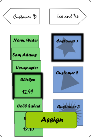
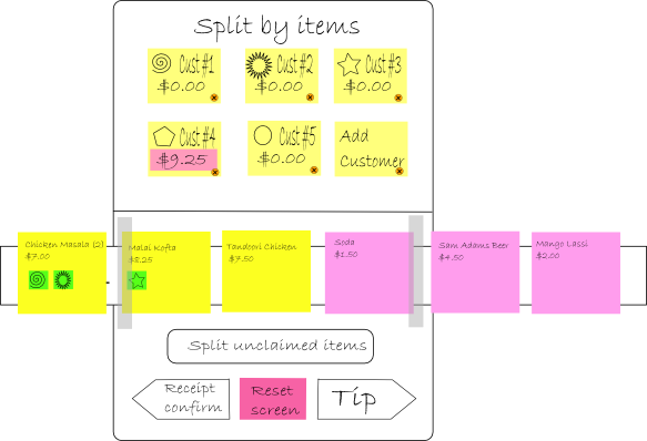
By interviewing several users and walking them through the two proposed prototypes, we discovered which features were intuitive, which were hard to understand, and which were unnecessary. We had two main designs, named the Not Your Average Joe's (NYAJ) design, and the Masala Art (MA) design, after the restaurant menu that it featured. The two main differences between the two designs are shown below; the NYAJ design relies on a compact, vertical depiction of informaiton, whereas the MA design relies on horizontal scrolling and dragging icons.


Design changes
Many of the design decisions we made were simple and impromptu; word choices like "assign" instead of "split" were made on the spot, and extra functionality requested was included on the fly. Some interesting small changes included titling food items by names rather than prices, and adding icons to indicate where the paycode was to be found. To assure the users that they are performing the right action for the right meal, we added a confirmation page in both the beginning and the end of the interaction. To make the process simpler, we decided that the paycode should be short and only have numbers. These are discussed further in our detailed codesign results page.
One complaint that spanned several users was the ability to identify customer icons. In the NYAJ prototype, text like "Customer 1", "Customer 2", etc, is provided on top of an icon with a faded out distinct image. One can edit the text by clicking on the keypad and entering in the customer's name. In the MA prototype, the same text is written on an icon, adjacent to an image, which is later used to indicate the customer in the interaction. The intent was to provide several ways of remembering a person: the image, the customer number, and the customer name. Whereas the first and second were given by default and thus afforded the user speed and ease, the first and third afforded the user a more familiar way of identifying people. We found that users that considered the long-term experience preferred the first mode, whereas users who saw themselves as new users prefered the second, as they cannot stand confusion.Although we do not have a good solution for users who both dislike hassle and confusion, we decided that an easy way to provide functionality to do both was to extend an "Edit customer info" page, which could be bypassed if necessary. The layout of this page is very similar to the default layout of the MA prototype, thereby allowing people to use positional memory to keep track of who was who.


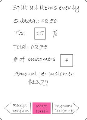
In response to the users who prefered speed over control, we added the addition of an "Express" option. Most users tend to split bills evenly in restaurants, and few deter from the traditional 15% tip amount. Therefore, in the express option, users can quickly specify the party number and edit the tip amount if necessary, then easily see the amount owed by each person. Given that users expect IPhone interactions to be faster than the alternative real-time interaction, this additional feature was well-received.

Since most users seems to find the interfaces for the MA design more intuitive than the interfaces for the NYAJ design, we decided to go with the MA design. Overall, users prefered the dragging and sliding interaction to clicking and entering, and liked to see the full extent of information without expanding capability. However, some of the unspoken qualities of the NYAJ design were carried over to our final design. Most users were much less confused to the purpose and necessary actions in the NYAJ design, which we believe results from the standardized titles and buttons on it that do not appear in the MA design. Also, the NYAJ design was created with careful consideration about design and density of information, something that was further improved in user interactions. In contrast, the MA design includes a lot of icons and relies on patterns to make density of information bearable. Although this allowed for an overall more draggable design, there were still many places where features were too small to be selected, something that was modified in emulation to the NYAJ design.


Another problem in the MA prototype is that by showing each dish as a seperate icon drop space, it used a much larger area. Having so many items to choose from provided a hassle problem..We thought about many ways to rearrange this, such as
- deleting used food items completely
- minimizing used food items to a different place
- collapsing all the used food items in one place
Ultimately, we found these methods hindering the user's ability to confirm what he/she had done. In solution 1, there is no possibility of recovering this information. Solution 2 and 3 offer a way to recover this information, but in 2, the icon sizes required would probably be too small, and in solution 3, the only way to uncollapse one food item was to uncollapse them all. We therefore solved this problem more indirectly. Instead of omitting items that were already used, we organized them in a way that was easy to navigate between by color coding each item by its type: drinks, entrees, desserts, etc.
We also received numerous negative feedback on the payment method page since the user finds it to be a hassle and it does not really help the waiter. The original intention of the payment methods option was to allow the interactions of trading cash and credit cards easy to keep track of. However, somehow, that got lost in the design, and we instead created a glorified calculator that could help people know how much they should be paying, but didn't take into account what would happen if they didn't have enough money or didn't have exact amonts of cash. We then contemplated whether it would be worthwhile to create a backend here that, with people entering in the amounts paid, would keep track of who owed who what. Though this extra feature would help our personas in the problem areas previously addressed, we ultimately discarded this idea because of its complexity. Although it can be difficult to deal with a receipt with 10+ items, it is less difficult to deal with price assignments among 5 or fewer people. In this case, people could probably keep track for themselves approximately what they owe without the extra burden of our application.
A feature that was not present in either design is the use of a "Reset" button on every screen. When interacting with non-IPhone users, we found a general hesitance to press any button. Although it was clear that no financial transactions were taking place, users were still uneasy about losing their hard-earned settings. By giving them a return-to-default option, we hope to encourage exploration.An alternative suggestion to solve confusion problems was the inclusion of a discrete help icon on every screen. We hope to test this feature more in our computerized prototype.
Testing incapabilities
Although our paper prototypes and user testing allowed us to improve and consolidate our designs, there were several areas in which they failed to be helpful.
First, users are quick to tell us what doesn't work for them right away, but they often find it difficult to imagine how they would view it after using it a couple times. Although it's important to cater to new users, since all users start out as new users, we have to be aware of what designs experience users find annoying. This theme carries through in all of our design decisions in balancing the tradeoffs between convenience and clarity.
Also, because we could not simulate a real dining experience, users sometimes could not properly imagine themselves in that situation. For example, while many users found that associating the icon, “Customer #1” and the name of customers confusing, they did not imagine a situation in which their friends might be seated in a row in front of them, and could not make a mapping from real situation to computer layout. Also, although dinner members may recognize easily who ate what after staring at plates for an hour or more, paper prototype testers were constantly unsure and confused of that information.
Finally, because of the shortage of IPhone users, we were unable to authentically test people's familiarity with our proposed features. Since we mimicked the design and action of the iPhone (ex. drag instead of click, pop up keyboards etc.), we are unsure if some of the non-intuitive actions are due to our interface, or due to the user's unfamiliarity with the capability of the iPhone itself.