Taking into account the heuristic evaluation, we made some design changes to our prototype.
On the first page, when the user clicks on the text box to enter their paycode, a keyboard appears from the bottom of the screen. iPhone standard for the layout of the delete and return keys has them both located on the right side of the keyboard, with delete located above return. Our keyboard is similar to the standard iPhone keyboard; however it is smaller due to the removal of numbers and some symbols. As a result, we only had room for one key to the right of the keyboard - we chose to locate the delete key to the right of the keyboard and then move the return key to the left of the keyboard. Our users found this very confusing, as they were accustomed to having the return key appear on the right side of the keyboard and ultimately were more willing to accept a non-standard delete key placement than a non-standard return key placement.
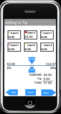
On the tip allotment page for users who split the bill evenly, we made several changes. First, we made our wording consistent, using the term "guests" to denote the users instead of the word "customers." We had used the word "guests" elsewhere in the prototype and this change helped unify our terminology. We also rearranged the location of the "subtotal - tip - total" bill display, moving it to the left of the screen from its position on the right. This location allowed us to increase the size of the tip selection slider bar and the size of the guest number selection wheel to help make them more visually dominating and easier to manipulate. The increased tip slider bar size allowed for an increase in the size of the blue tabs on the tip slider, making it easier for the user get instant feedback on the effect of their drag - it also allowed for the tabs to properly display four digit tip values which in the previous prototype ran off the side of the tabs. In addition to increasing the size of the guest number selection wheel, we changed the wheel such that whichever number is selected will appear bold; the increased size and the bolding of the selected number make it easier for the user to correctly select the number of participating guests.
On the second page, the receipt confirmation page, the receipt number that the user typed in on the previous screen is now shown below the receipt, above the back button. This allows users to be better informed of errors they make, as it shows them whether they received the wrong receipt because they entered the wrong receipt number or because of an error with the application itself.
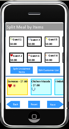
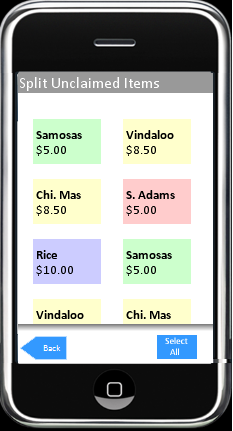
After the user chooses the option to split their bill by item, they are presented with an option to split the remaining unclaimed items evenly between users. On the "split unclaimed items" screen associated with the "split meal by items" screen, we added a button and changed the labeling of the buttons. Previously, two buttons existed, a "back" button on the left and a "select all" button on the right. The idea was that the user would click the back button to return to the "split meal by items" page - both in situations where they wanted to save the changes they applied in the "split unclaimed items" page and in the situation where they accidentally navigated to the "split unclaimed items" page. This turned out to be very confusing, so we renamed the "back" button to "cancel," allowing the user to exit the page without saving any changes. We added a new button on the right titled "split," which returns the user to the "split meal by items" page after saving the changes applied. We kept the "select all" button and relocated it to the center of the screen. As a result, the page should be more intuitive to use.
On the bill confirmation screen, the last screen users see, we added functionality to allow the user to click on a guest and view the items assigned to that guest. Our previous confirmation screen allowed the user to confirm that the dollar amounts attributed to each user added up to the correct bill total, however it did not allow the user to check that each guest had the correct items being attributed to them.
In a similar manner to the confirmation screen addition, we added additional confirmation functionality to the "split meal by items" page. On the first prototype, clicking on menu items would bring up a window displaying which users had been connected to that menu item. Clicking on a guest, however, did nothing. We added a feature to each guest icon allowing a click to bring up a window displaying which menu items were assigned to that guest. Clicking on a guest to check which menu items they were assigned is a more natural interaction than browsing through each menu item to confirm that each guest is assigned the correct items and we expect this feature to ease customer frustration by allowing them to more easily confirm the actions they have made on the "split meal by items" page before moving to the tip selection page.
15. [H7 Flexibility and Efficiency of Use]
16. [H2 Match Between System and Real World]
These two problems reported in our heuristic evaluation essentially comment on the same issue, the design of the "Split Meal by Items" page. In both reports, the evaluators felt that the system of dragging icons representing people to icons representing food items was not intuitive or effective. During the paper prototyping phase of the project, we created rough prototypes of designs which featured both the person->food action and the food->person action. From the feedback we received during our initial usability studies it emerged that users found dragging people to food items more intuitive. We took the person->food action forward into our final prototype, and this time users participating in our heuristic evaluation felt that food->person would have been more efficient. We have decided not to change this action in our next revision of our prototype because we feel that the two conflicting usability reports show that the interaction's feel and efficiency are highly dependent on the individual user's preference. After discussion, we feel that changing this interaction would not solve the issue of efficiency for all users. Additionally, a change to this interaction would necessitate a full redesign of the whole prototype's interface, as we currently have a consistent interface across all pages and changing around this page would make it inconsistent with the rest, possibly causing a cascading effect as other interactions within our software would be affected.
5. [H3 User Control and Freedom]
6. [H1 Visibility of System Status]
Our tip selection system utilizes a slider to select a tip percentage. We initially decided that the slider should only have resolution to the single percent level - although the slider is continuous, it can only select tips in one percent intervals: 10%, 11%, 12% etc. Our tip selection system did not include an option to select or input a tip value, only including the option to select a percentage. This interaction makes it very difficult for the user to select a tip value which would create an even value for the overall bill. When paying with cash, as our users do, it is more important to pay an even amount, for instance $25, than it is to leave an exact percent tip, for instance a 15% tip. We have selected this usability issue as one to explore further with a formal experiment design to improve the usability of this feature. We are creating three tip selection options which we will use as our independent variables: allowing users to select tips using our current method, changing the tip slider to "snap" to convenient, round numbers (15% tip brings the bill to $14.89, system adjusts tip percentage to round up to $15), and changing the tip slider to "snap" to numbers which make each individual pay a convenient amount (bill split between three people would be $21.50, system rounds to $21.75).
7. [H1 Visibility of System Status]
When the tip amount selected exceeded $9.99 (3 digits) the tip amount was not fully visible, with digits being cut off. We increased the width of the tip slider (the movable part which is dragged along the tip selection bar) such that the tip slider can support four digits and properly display larger tip values.
8. [H1 Visibility of System Status]
22. [H1 Visibility of System Status]
Users completing a heuristic evaluation of our prototype commented that our tip slider design, which displays the selected tip percentage above the tip selection bar and displays the selected tip value below the tip selection bar, should be changed to place the tip value somewhere other than below the bar. These evaluators speculated that on an iPhone, dragging the slider with the fingertip would cause the user to obscure the numerical tip value while the slider is being manipulated. We decided to keep our original design, placing the tip value below the bar. If we were to port a version of this software to the iPhone, we would utilize the iPhone software package allowing our slider to increase in size when it is manipulated to help minimize this issue. With our current javascript implementation, we decided it wasn't worth the time to implement, as the issue does not appear when the slider is manipulated with a mouse cursor.
13. [H7 Flexibility and Efficiency of Use]
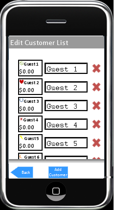
The interaction of assigning names to customers in our interface is slow, requiring users to type in a name with a pop-up keyboard. Our initial usability tests indicated that naming customers was a feature that many users wanted, as we originally planned not to include the feature in the interest of speeding up the food/customer and ended up constantly having users asking for the feature. We decided to include the feature, as it was a useful feature to some of our users, although we agree that the interaction is slow. If we were to port this to the iPhone, we would include an icon which would link to the user's address book, allowing them to add friends' names quickly. Unfortunately, an address book is outside the scope of our prototype, so this feature will remain "Not Yet Implemented (NYI)."
26. [H4 Consistency and Standards]
On two particular screens, the "Split Unclaimed Items" and "Edit Guest List" screens, we used a button titled "Back" to return the user to the previous screen and save changes that they implemented on the "Split Unclaimed Items" screen. All other screens use a "Back" button to go the the previous page without saving changes. We corrected this state-saving discrepancy by changing the button titles on these screens to "Cancel" a button which returns you to the previous page without saving changes, and "Split/Done" a button which saves your changes and returns you to the previous page.
27. [H5 Error Prevention]
The function of "Split Unclaimed Items" page was unclear to some of our users. We have decided not to change the labeling of this page, as we felt it would be difficult to make the wording more clear while preserving the conciseness of our current labeling. We did address the problem of users making mistakes on the page, however, as we added an undo feature which allows the user to easily fix any mistakes they make using the page.