Final Design Introduction
We attempt to address the problem of splitting the bill at a restaurant. Often, when a group of friends go out together, they struggle to decide how much each person owes. This, compounded with an often complicated scheme of owing and covering, makes it hard to figure out the actual amount each person needs to actually put in the pool.
To address this problem, we provide a partial solution through an IPhone application, "IPayr," that calculates how much each person should be responsible for paying. The application takes into account tip and tax, and can be operated in two modes: splitting evenly or claiming items. Through this process, the user will arrive at a final page that lists the amount owed by each member of the group; at this point, the members of the group can decide their form of payment and their complicated covering scheme based on the amounts calculated.
Personas and scenarios
Our personas and scenarios did not go through many detailed revisions, but as we narrowed our design space, we stopped using some of them. Although we began with five personas, spanning over a wide range of restaurant users, our prototype was ultimately targeted to a narrow user space, and thus we only used two personas heavily: Liz the new-grad employee and Joe the college student; these personas can be found here. Our scenarios also didn't change very much, but because we reduced several features of our prototype, the 3rd scenario, where we deal with payment methods as well as assignments, is no longer applicable. However, we are still using Scenarios 1 and 2, where people split the bill evenly or by item.
Prototype Revisions
The prototype was revised numerous times, documented in the following pages:
The final prototype as well as the implementation tools can be found at the "final prototype" section under Final Refinement.
We feel that the low-fi prototype run-through was the most valuable evaluation technique used. The paper prototype allowed us to very quickly evaluate several large concepts, such as sliding, drag-drop, people-food assignment schemes, selecting through expansion or through highlighting, etc. In many ways, our early stage paper prototypes better approximated the iPhone due to the tangibility and affordances paper provides. Our more refined prototypes offered less value because they were less flexible to these large changes. Additionally, because our more refined prototypes were not on the system they were designed for (the iPhone), these later prototypes could not be used to fully visualize our intended interaction.
One major downside to the paper prototypes was the speed at which they operated which had a large impact on the apparent speed of our system. This was in part due to the numerous processes which our “computer” had to take care of (such as updating many text displays anytime a change was made). This is especially important because the app is supposed to simplify the bill paying experience and by having a cumbersome interaction, the perception of the prototype is damaged. In retrospect, we think it would have been useful to simplify the functionality of the paper prototype to increase the speed of transaction. In later tests we realized that users do not actually look at the totals in each of our many text displays showing totals since they were simply following a scenario and not expected to actually pay any money. While dynamic updating of the displays is important, it would have been sufficient to represent these in a simpler manner in the earlier prototypes. This could have greatly improved the timing of the paper prototype evaluation, and given us a more accurate measurement of the tediousness of the interaction.
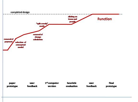
This graph shows the refinement of the functionality of our design with the dotted line on top indicating our final design. The closer the line is to the dotted line implies that the design is more complete. Much of the functionality existed from the start of the development process, which a large chunk of the functionality occurring when we made design decisions to not include payment and change calculation. By the time we reached the first computer prototype, almost all of the functionality was present. The “split evenly” mode added a new way to access existing features and clicking on people and items provided another way to visualize information.
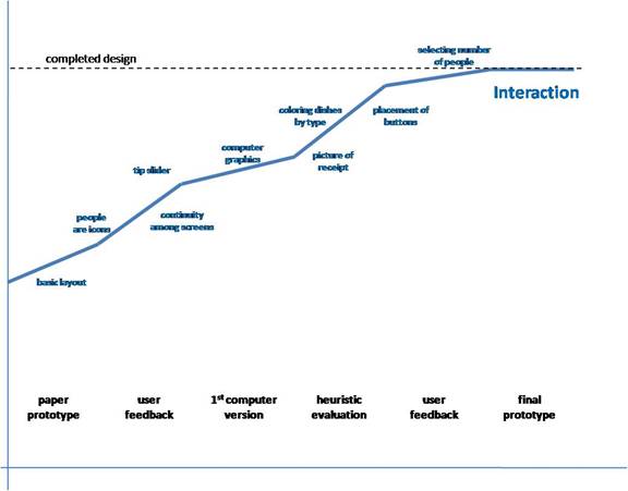
In our design, much of the interaction is dictated by the overall layout of the software. Thus, from the early stages a non-negligible portion of the interaction was determined. As we received feedback from users on the paper prototype we ramped at a decent speed, making many decisions which impacted interaction greatly. As we redid the design in the computer, we had the opportunity to make new decisions which also shaped our interaction. From the heuristic evaluation, many small changes were made which had a large overall impact on usability and interaction. Near the end, the interaction changed at a slower rate, as it approached its final state.
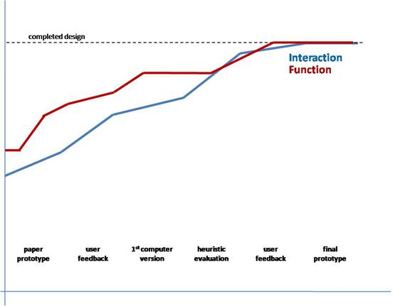
From this overlay we see that the by the start of the heuristic evaluation, both the function and interaction were fairly well confined. While early on the function was better defined, near the end of the process the changes occurred at a slow, but similar rate. This suggests that the early stages were very influential in the overall design.
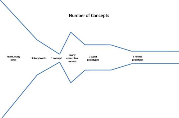
After generating many ideas, we took a relatively small number forward to the storyboard phase at which point we decided on a single idea to work on for the remainder of the semester. We then identified several potential conceptual models within the broad idea before narrowing again. Once we had selected one of two conceptual models (at the paper prototype stage) we kept with a single concept for the rest of the semester.